
Wood Floor Colors: How to Choose Warm, Cool or Neutral Tones
Read the undertone first; the depth of color matters less than which way it leans.
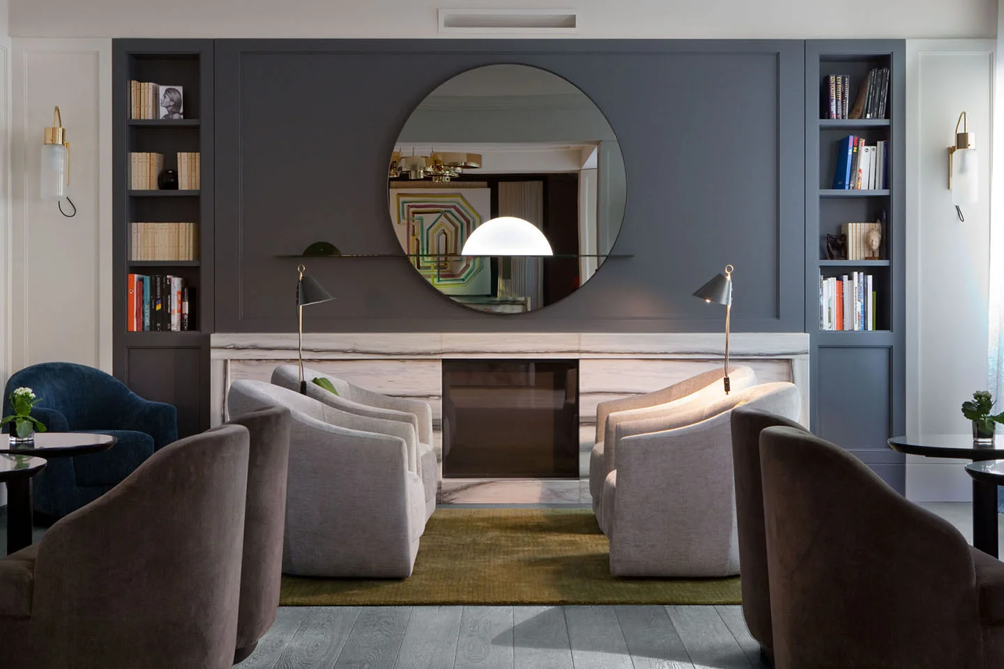
Wood floor colors fall into five broad families: pale and natural, honey and golden, mid brown, dark brown and black, and white or gray. Choosing among them comes down to the undertone of the wood (warm, cool or neutral), how much light the room gets, and what other wood sits in the room. Get the undertone right and almost any depth of color will work.
What are the main wood floor colors?
Most wood floors, in oak or any other species, sit in one of these groups. The table shows what each does to a room and what it shows in daily life.
| Color family | Undertone | What it does to a room | What it shows |
|---|---|---|---|
| Pale and natural | Neutral to slightly warm | Reflects light, makes rooms feel larger and calmer | Hides dust and fine scratches; shows dark spills |
| Honey and golden | Warm | Adds warmth, softens cool daylight and white walls | Forgiving of everyday wear |
| Mid brown | Warm or neutral | Grounds a room without darkening it | The most forgiving of dust, grit and scratches |
| Dark brown and black | Neutral or cool | Dramatic; makes walls and furniture stand out; can shrink a dim room | Shows pale dust, pet hair and footprints most |
| White and gray | Cool | Bright and crisp; gray can feel cold in low light | Shows dirt in the paths people walk |
Interest is moving toward the light end. Over the last year, searches for light oak flooring and white oak flooring have grown sharply, faster than searches for dark floors.
How do you tell warm, cool and neutral wood tones apart?
Look past how light or dark the wood is to the way it leans. Warm woods lean yellow, gold, orange or red. Cool woods lean gray, taupe or blue-black. Neutral woods sit in between, a sandy beige with no strong pull either way.
The simplest test is a sheet of plain white paper laid next to the floor or the sample in daylight. Against the white, the bias shows: gold, pinkish red, gray or beige. Then look again in the evening under your own lamps, because warm artificial light pushes every wood toward amber.
The species sets the starting point. Oak is neutral to slightly warm in its raw state, which is why it takes such a wide range of finishes. Walnut is a deep chocolate brown, cherry a pinkish brown, maple a pale cream. The finish then moves the color: a clear matte finish keeps oak close to its natural tone, oils deepen and warm it, white pigments cool it, and smoking or fuming turns it brown or near black.
How does light change the color of a wood floor?
Light changes a floor twice. First in the moment: north-facing rooms get cooler, bluer daylight that makes a gray or pale floor look colder, while south and west light brings out gold and amber. A warm floor often suits a north-facing room; a neutral or cooler one can calm a room the sun floods.
Then over time. Daylight and air slowly alter the natural compounds in the wood, so most species shift color in their first months and years. Pale oak warms and ambers a little, cherry darkens markedly, and walnut tends to lighten. Rugs leave paler patches on a young floor, which even out if they are moved now and then. Expect a natural floor to warm slightly, and choose your sample with that in mind.
Warm wood floor colors
Honey, golden and warm brown floors suit rooms that need comfort: cool north light, white or cream walls, a lot of stone, glass or metal. They sit well with earthy wall colors such as terracotta, ochre, olive and warm whites, and with brass, leather and linen.
In OscarOno Paris's straight plank, Droit, a plain oak board in twelve colors, this is the territory of Miel Doux (a honey tone) and Brun Doux (a soft brown), alongside the plain, natural-looking Naturel.
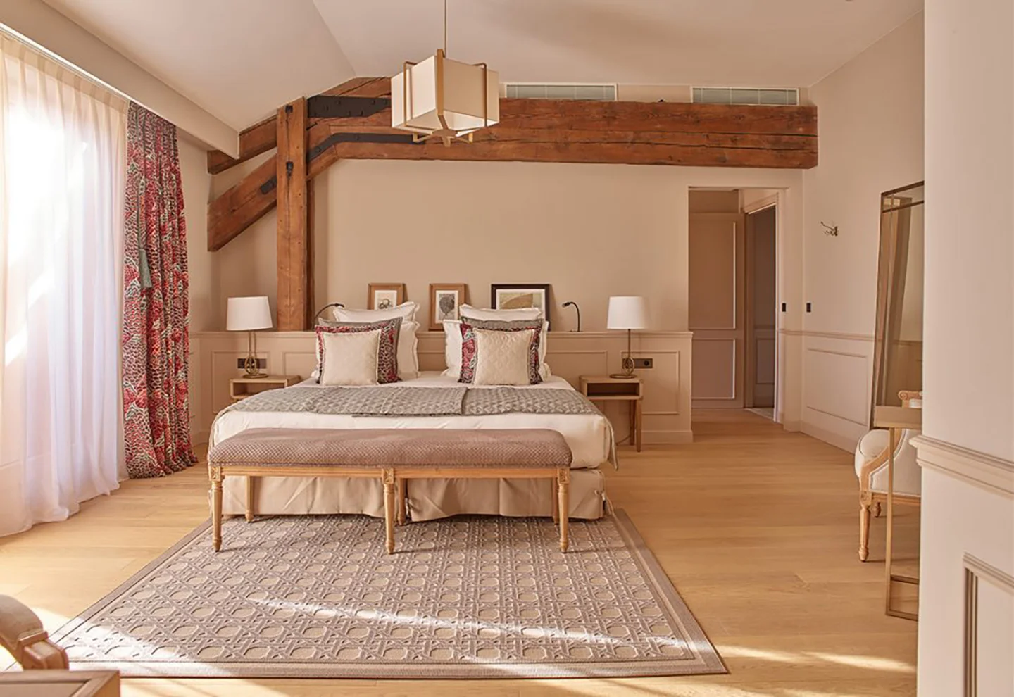
At Hotel Chais Monnet in Cognac, Droit is laid in Miel Doux, a warm honey tone on straight boards.
Cool and dark wood floor colors
Gray, blue-gray, charcoal and black floors read as more architectural. They make white walls look crisper and give art and pale furniture a strong backdrop. They need light: in a dim room a very dark floor absorbs what little there is and makes the space feel smaller, so pair it with light walls and good lighting.
Pattern changes how a dark floor reads. On straight boards the color comes across almost as one plane. On a herringbone such as Rompu, OscarOno Paris's oak herringbone, the grain runs in two directions, so in raking light one set of boards looks lighter than the other and even a very dark floor shows texture. Droit and Rompu share the same colors, including Rocher Bleu Gris (blue-gray), Rocher Charbon (charcoal) and Rocher Noir (black).
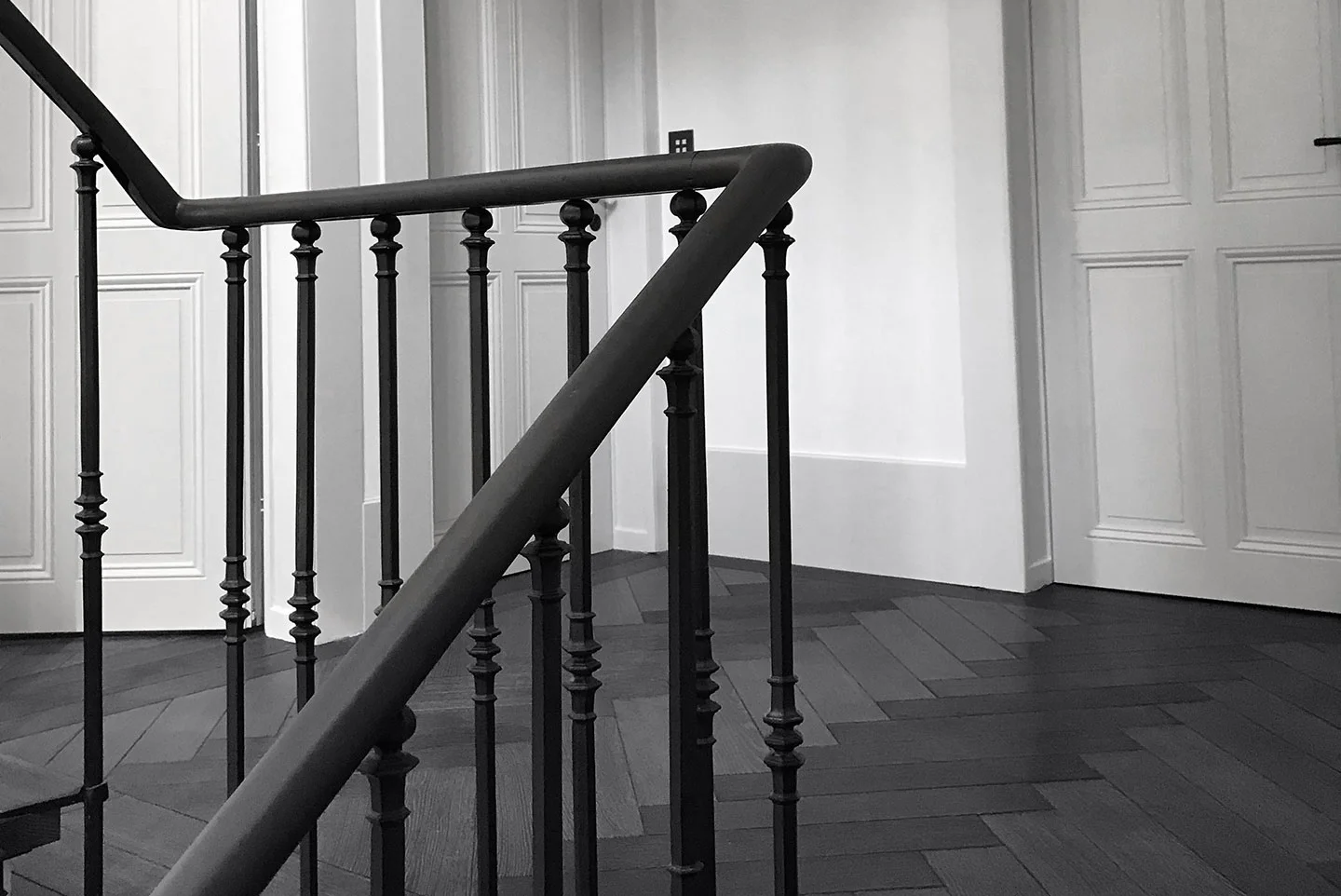
This private residence in Geneva is laid in Rompu in Rocher Noir, a black herringbone.
How do you match a wood floor color to walls and furniture?
- Choose to complement or to contrast. Complementing keeps floor and walls at the same temperature: a warm floor with warm whites, clay or ochre. Contrasting pairs a cool floor with warm walls, or the reverse, which gives a room more depth and tension.
- Let one wood tone lead. The floor is usually the largest wood surface in a room, so treat it as the base and keep other woods clearly lighter or darker. Mixing warm and cool woods works as long as one temperature dominates.
- Avoid the near match. A table almost the same tone as the floor looks like a mistake. A clear step in depth, or a deliberately different species, looks intended.
- Treat cabinetry the same way. Kitchen units a shade off the floor tend to clash; units clearly lighter, clearly darker or painted look deliberate.
- Repeat the undertone somewhere else. A rug, a fabric or a frame that picks up the gold or gray of the floor ties the room together.
Which wood floor colors hide dirt and scratches?
Mid tones with visible grain are the most forgiving: they hide dust, grit, crumbs and fine scratches. Very dark and black floors show pale dust, pet hair and footprints most, and white floors show dark dirt where people walk. Sheen matters as much as color: a matte surface hides wear that a glossy one shows in every reflection.
How deep the color goes matters too. A stain or pigment colors the surface, so a deep scratch can reveal paler wood beneath. Smoking or fuming reacts with the tannins in oak and darkens the wood itself rather than coating it. That is why OscarOno Paris's endgrain collections come in Natural, Smoke (smoked through the full depth of the oak) and Black (charred, in the shou sugi ban tradition), and are never stained. Droit and Rompu work differently: their twelve colors are lacquered, so the color is protected under a sealed surface.
Frequently asked questions
What is the most popular wood floor color right now?
Light and natural oak. Searches for light oak flooring and white oak flooring have grown sharply over the last year, faster than searches for dark floors. Mid browns remain the most forgiving choice for busy homes.
Should a wood floor be lighter or darker than the walls?
Most rooms feel settled when the floor is darker than the walls and the ceiling is lightest of all. A floor lighter than the walls works too, but it makes the room feel brighter and less anchored, so it suits rooms with plenty of furniture, rugs and color.
Can you mix warm and cool wood tones in the same room?
Yes, as long as one temperature dominates. Treat the floor as the base, keep other woods clearly lighter or darker than it, and repeat the floor's undertone in a rug or fabric so the room holds together.
How do I find the undertone of my wood floor?
Lay a sheet of plain white paper on the floor in daylight. Against the white, the wood will lean gold or orange (warm), gray or taupe (cool), or sandy beige (neutral). Check again under your evening lighting, which warms every wood.
Which wood floor color is easiest to keep clean?
Mid tones with visible grain and a matte surface. They hide dust, grit and fine scratches best. Very dark floors show pale dust and footprints, and white floors show dark dirt where people walk.
Choosing a floor color with OscarOno Paris
Droit and Rompu share the twelve lacquered Essentiel colors, from Tout Blanc and Naturel through Miel Doux and Brun Doux to the darker Rocher tones, so you can choose the color first and the pattern second, or the other way round. Both are flatgrain select oak, 12 mm with a 4 mm top layer, 150 mm or 190 mm wide, rated usage class 33 for heavy commercial traffic, Cfl-s1 for fire, and FSC and PEFC certified.
A floor color cannot be judged on a screen. Order samples and look at them on the floor, in your own light, morning and evening. Spec sheets, CAD and 3D files are in the library.
More from the Atelier
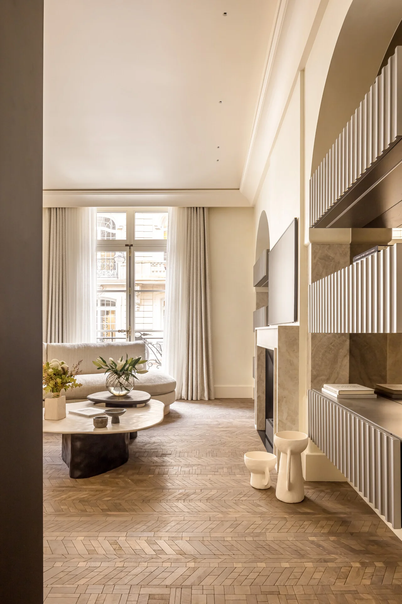
What Is Wood Terrazzo Flooring? An Architectural Guide
Wood terrazzo flooring unites reclaimed endgrain oak offcuts and mineral ground, creating continuous, tactile surfaces designed for circular luxury interiors.
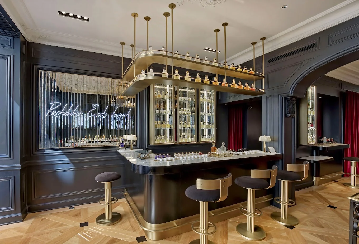
Modern Versailles Parquet: The Classic Panel in Today's Interiors
The woven oak panel first laid in a palace still works in a contemporary room. What changes is the color, the construction and how freely the weave is drawn.
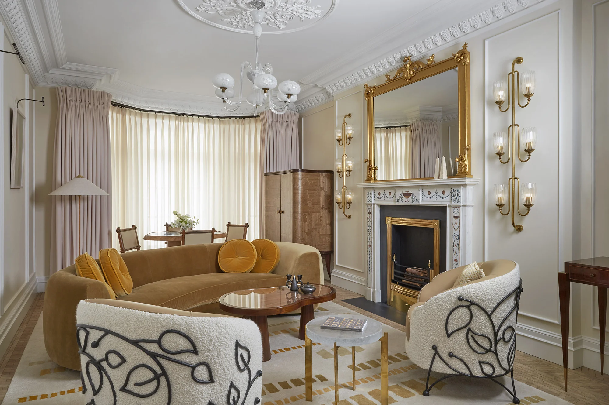
Wood Floor Interior Design: Pairing Oak with Linen, Stone and Brass
Start with the floor, then balance it: stone for weight, linen for softness, brass for light. A practical guide to designing a room around wood.